On the path of Anime-style photography, one often finds oneself in an awkward, middle-of-the-road position. Speaking of composition, you at least know the rule of thirds and leading lines; speaking of color grading, you can set the basic tone for highlights and shadows in Lightroom. But when put together, it just lacks that soul-stirring flavor. This state is indeed like the Gold or Platinum tiers in ranked games—you've accumulated basic experience and your level is relatively stable, but it's hard to achieve a qualitative leap to master a more top-tier image texture.
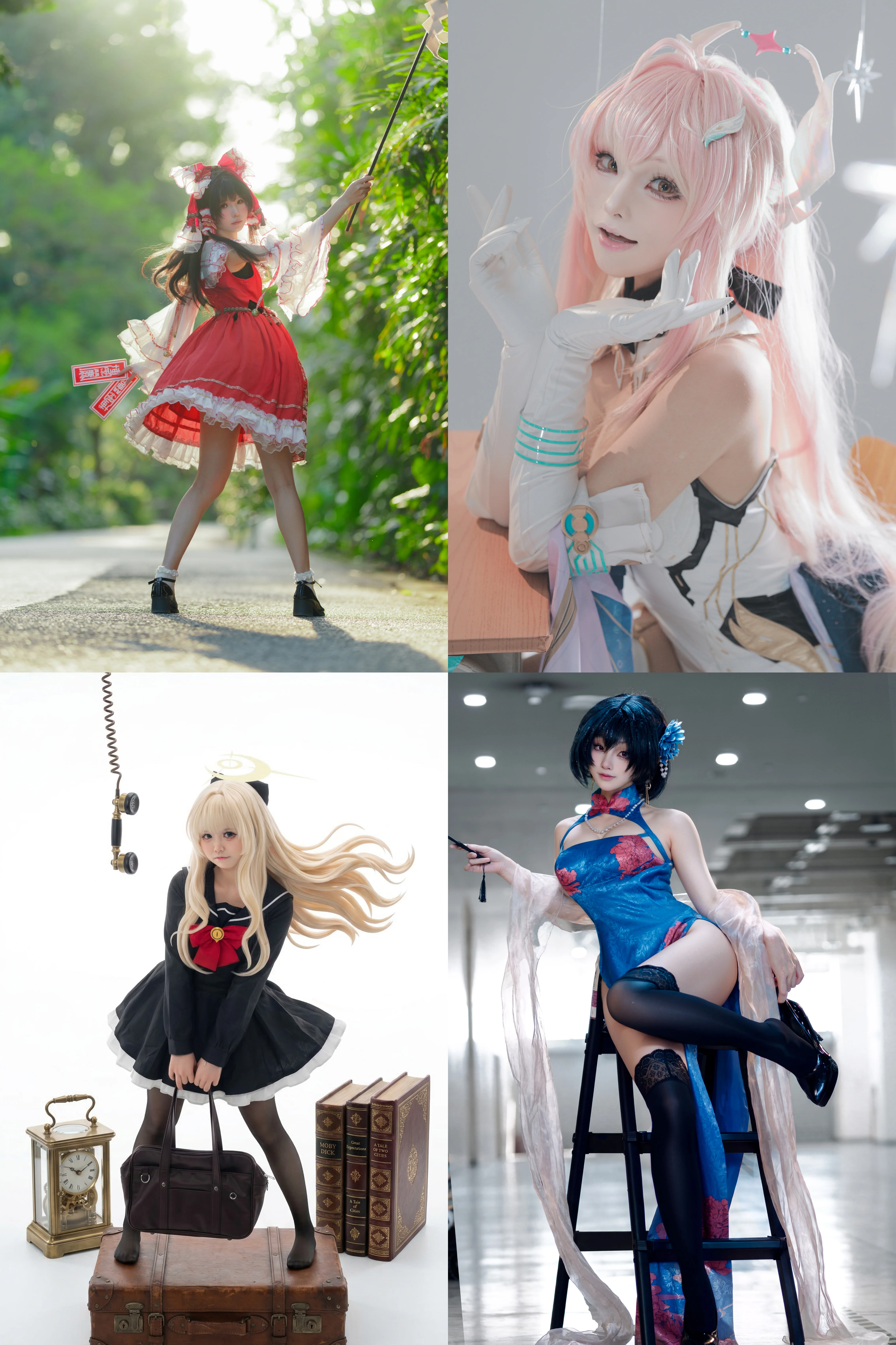
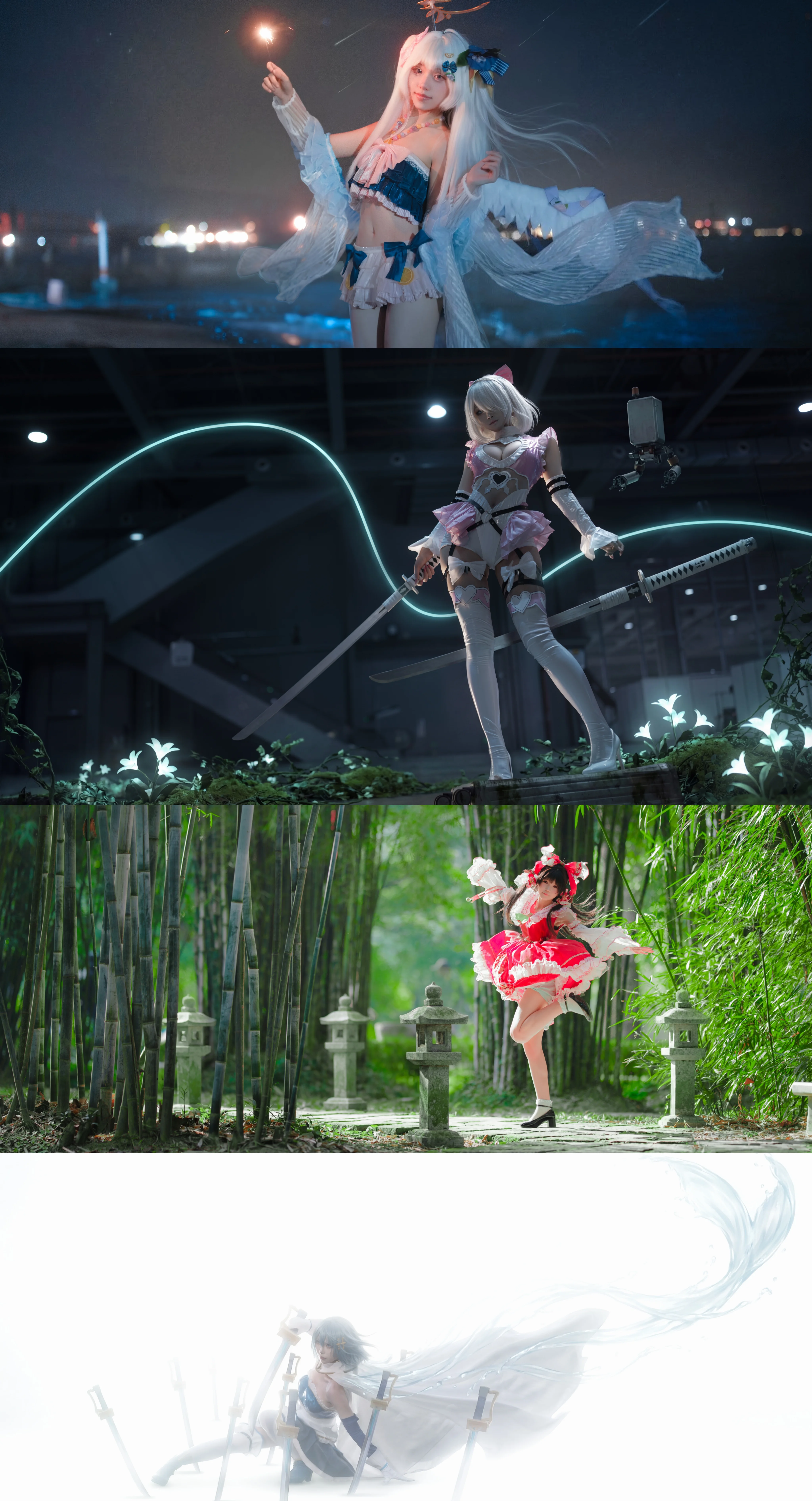
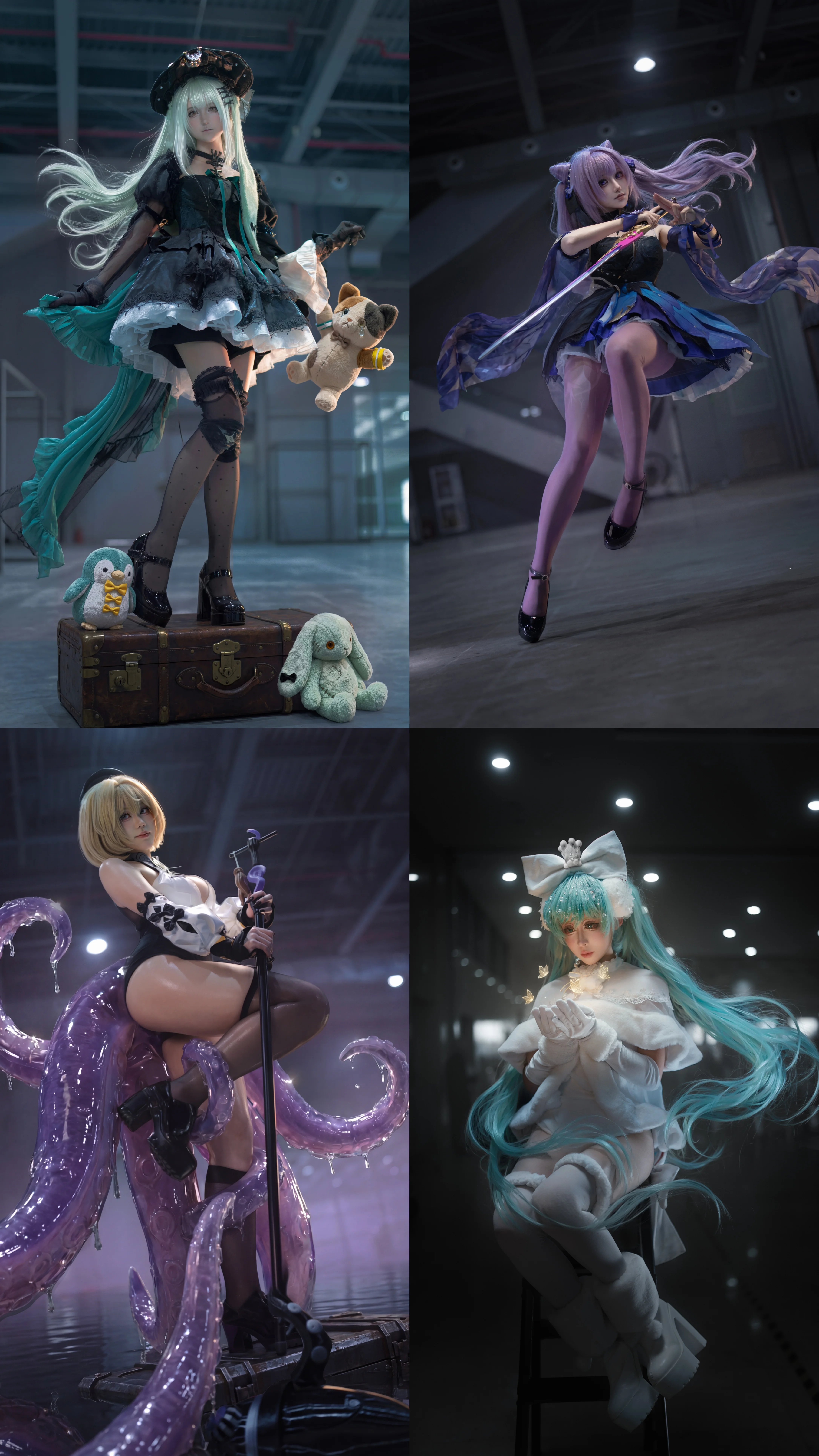
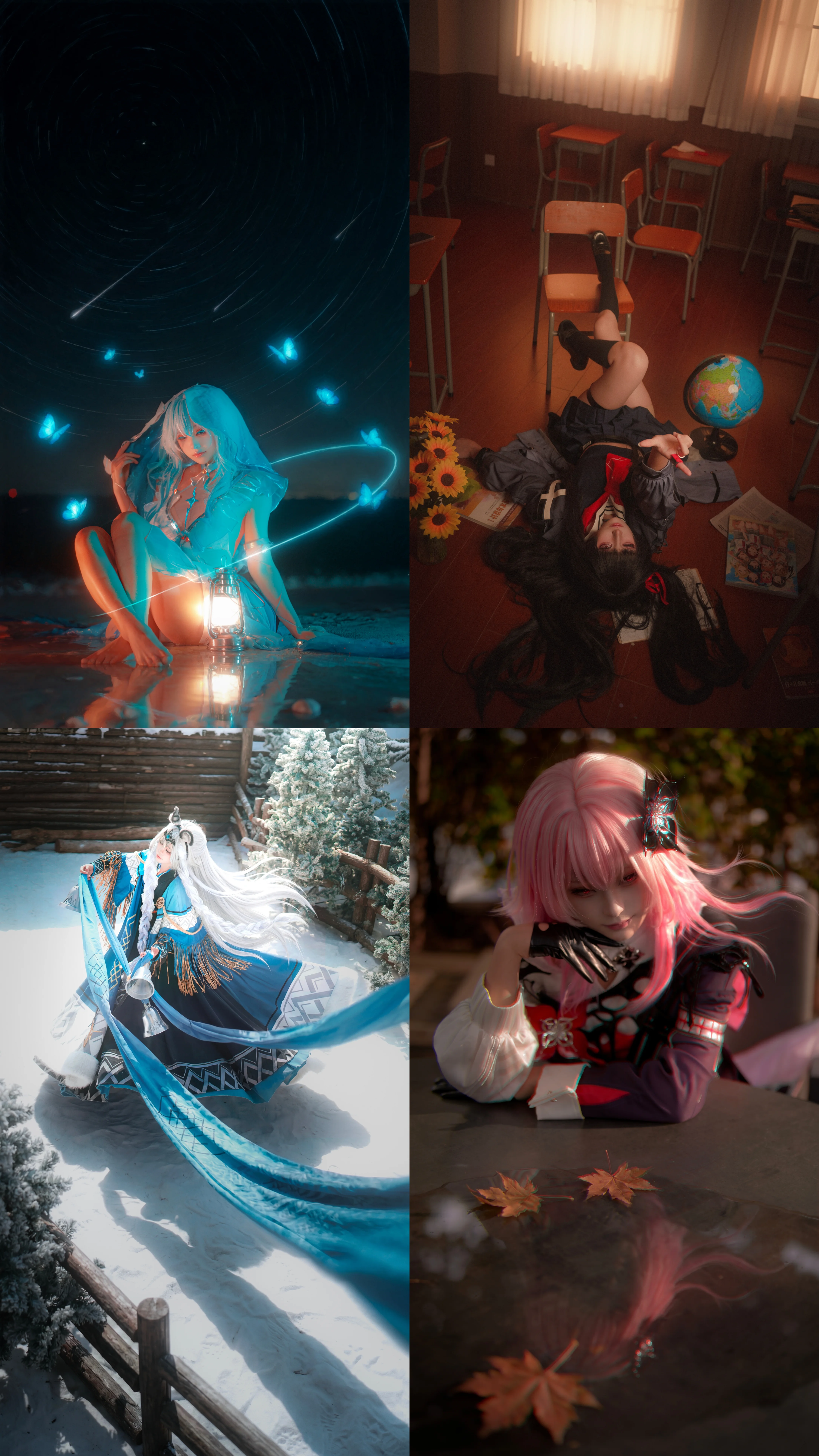
The few sets of photos brought this time span quite a wide range of attempts, from initial preparation to final retailing, covering a wide range of styles. Considering visual richness, the selected combinations cover the tranquility of outdoor bamboo forests, the coldness of snowfields, the retro vibe in classrooms, and the drama created by lighting in indoor low-light environments. As for costumes, besides the casual and fantasy-oriented sailor suits and the blue Qipao with Chinese elements, there are also several heavy-vfx looks that require extensive photography post-processing. Different styles correspond to completely different lighting logics. For example, the bamboo forest set relied entirely on the diffusion of natural light, with the model's skin tone brightened during post-processing; while the starry sky and deep blue tentacle shots relied more on artificial lighting assistance and the post-production composition of light streaks, star trails, and blue glowing points. This complex scene stitching and special effects synthesis happen to be the key areas of my current practice, yet they are also my pain points.
In my attempts at post-production color grading, I paid special attention to color harmony for this group of images. For instance, combining red and dark green in the anime costume and background, utilizing complementary colors to enhance the vividness of the frame; or using a large area of cool-toned background to highlight the white wig and attire. However, I am well aware that my current color grading style is still somewhat formulaic. Sometimes, pursuing the so-called 'internet aesthetic' and high contrast too much results in skin tones that aren't translucent enough, or highlights that look overly harsh. The essence of photography post-processing should be to elevate the visual experience, rather than just to show off skills. Every anime costume and scene has a color system that suits it best, which is exactly what I need to feel and master right now.
Reviewing these works from the model's perspective, I realize there is still a lot of room for improvement. During the shoot, although I tried my best to cooperate with the photographer to showcase the highlights of the outfits—such as the leg lines of the sailor suit paired with stockings and boots, or the languid feel created in the Qipao look—overall, the tension in my body language was still slightly lacking. Some poses were struck, but they didn't fully integrate into the scene's atmosphere. An excellent coser should be able to instantly make themselves a part of the scene right after putting on the character's anime costume. How to make oneself more relaxed and confident in front of the lens, and how to convey emotions through eye contact and subtle movement adjustments, are the internal skills I need to continue cultivating.
Regarding the shoot for the Qipao set, we actually tried to make the character stand out in a low-key environment, but the balance between the black thigh-high stockings and the skin texture under dim light wasn't fully resolved. After pulling up the curves in post, the background looked excessively dull and greyish. This is a common contradiction that needs balancing during post-production color grading. Sometimes I also wonder if I am getting too caught up in how gorgeous the output looks, thereby neglecting the fun of shooting itself and more fundamental, genuine emotions. Being stuck in this bottleneck period, I really hope to hear some incisive advice. Whether it's about the model's expressiveness in front of the camera, the fluidity of postures, fill-light techniques on the photography level, the integration of special effects with the frame during post-processing, or even basic pairings of natural and artificial light, I hope to get practical guidance from seasoned photographers or fellow enthusiasts. My current goal is to ensure that the next time I shoot a similar set of images, it won't just look good at first glance, but will also withstand close scrutiny of details in color and atmosphere when zoomed in. Posting these photos is my way of using this sharing session to clearly figure out which direction I should take next to hone my skills.