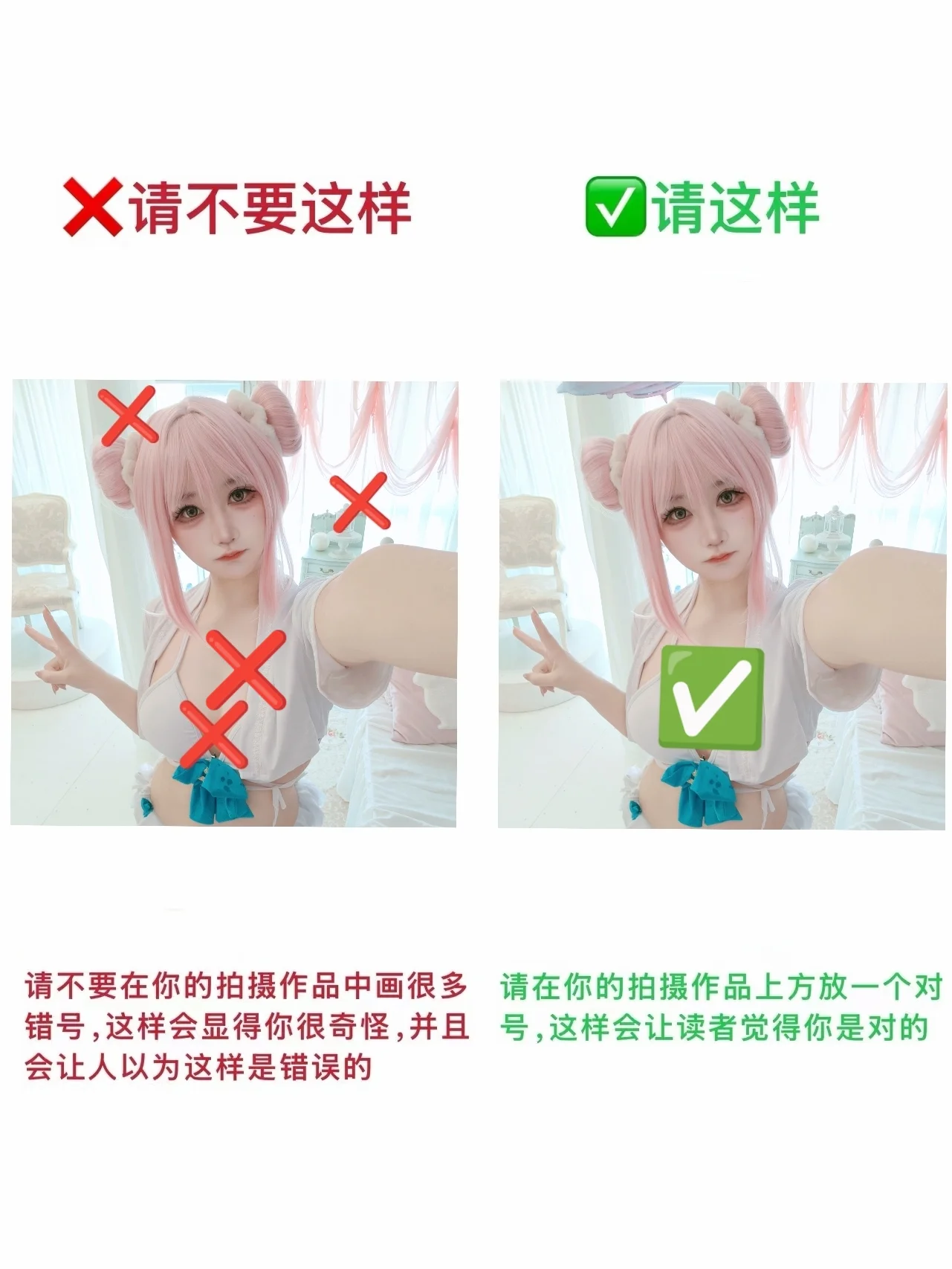
While working on this Misono Mika cosplay shoot from Blue Archive, I ran into a dilemma during the post-production phase regarding Watermark layout. Rather than letting everyone stumble into the same pitfalls when posting photos, I decided to use my own issue as a side-by-side demonstration—hence this comparison image. This set features Misono Mika from Blue Archive. The pink double-bun wig with highlights posed the biggest challenge during styling: setting the shape required a generous amount of hairspray while carefully ensuring loose strands didn't scatter to obscure facial contours. The white top features a unique collar design paired with a blue-toned bow belt, delivering a fresh and lively visual presence overall. Sweet characters like her usually suit various playful gestures; during the shoot, I deliberately chose a peace-sign pose extending my hand toward the lens, creating a touch of perspective foreshortening that injects dynamic visual tension into the frame.
However, when I attempted to annotate the formal photos to output a layout suggestion guide, a challenge emerged. On the left side render, I used numerous red 'X' marks across the character's head, arms, and chest, originally intending to highlight specific points clearly. Yet I ultimately realized those red crosses not only obscured wig texture details and skirt layering, but more lethally created a psychological suggestion in viewers, making them wonder if something was wrong with the Anime cosplay itself. As someone who frequently shares in the community, I know all too well how easily a misannotated photo can turn into a negative example in a Photography Tutorial context.
Thus, I decisively revised it into the right-hand layout, replacing all scattered red X's with a single prominent green checkmark symbol. Positioned directly in the lower-center of the frame, even though it serves as a watermark itself, the visual impression it conveys is entirely positive and affirming. Viewers naturally perceive the work as highly professional and confident, eliminating any misunderstanding about alleged defects. This comparison photo actually reveals an essential truth in post-production Watermark layout: when adding watermarks or annotations to your work, always utilize positive, encouraging symbols—use checkmarks frequently and avoid crosses. Red X symbols easily trigger associations with correction, errors, and negation, which is thoroughly unrewarding for cosplayers who spent immense time and energy prepping costumes, props, and wigs through long shoots and retouching.
To portray the gentle, innocent, and slightly refined young-lady demeanor of Misono Mika from Blue Archive, our layout must similarly cultivate a clean, crisp atmosphere. Whether placed along frame edges or prominently featured like the right image, a green checkmark maintains visual neatness and consistency far better than scattered red X's. I am sharing this experience because recent shoots deeply impressed upon me that great Cosplay is expressed not only through makeup and poses before the lens, but also through back-end Watermark layout and detail control. I hope this intuitive watermark tip in this Photography Tutorial helps everyone enhance the texture and professional polish of their work in future photography sharing.