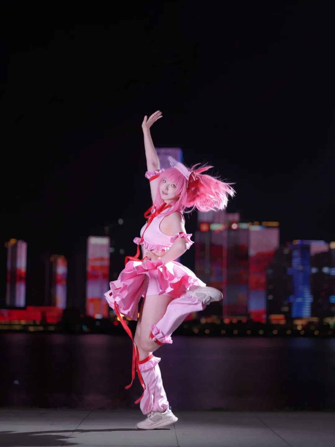
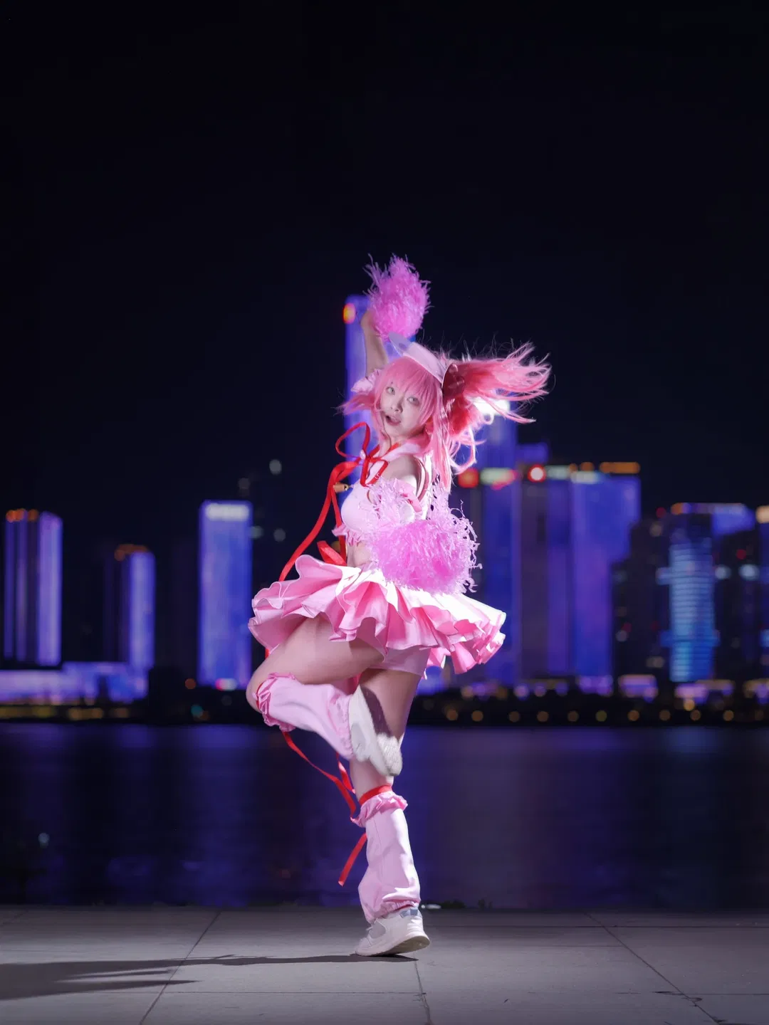
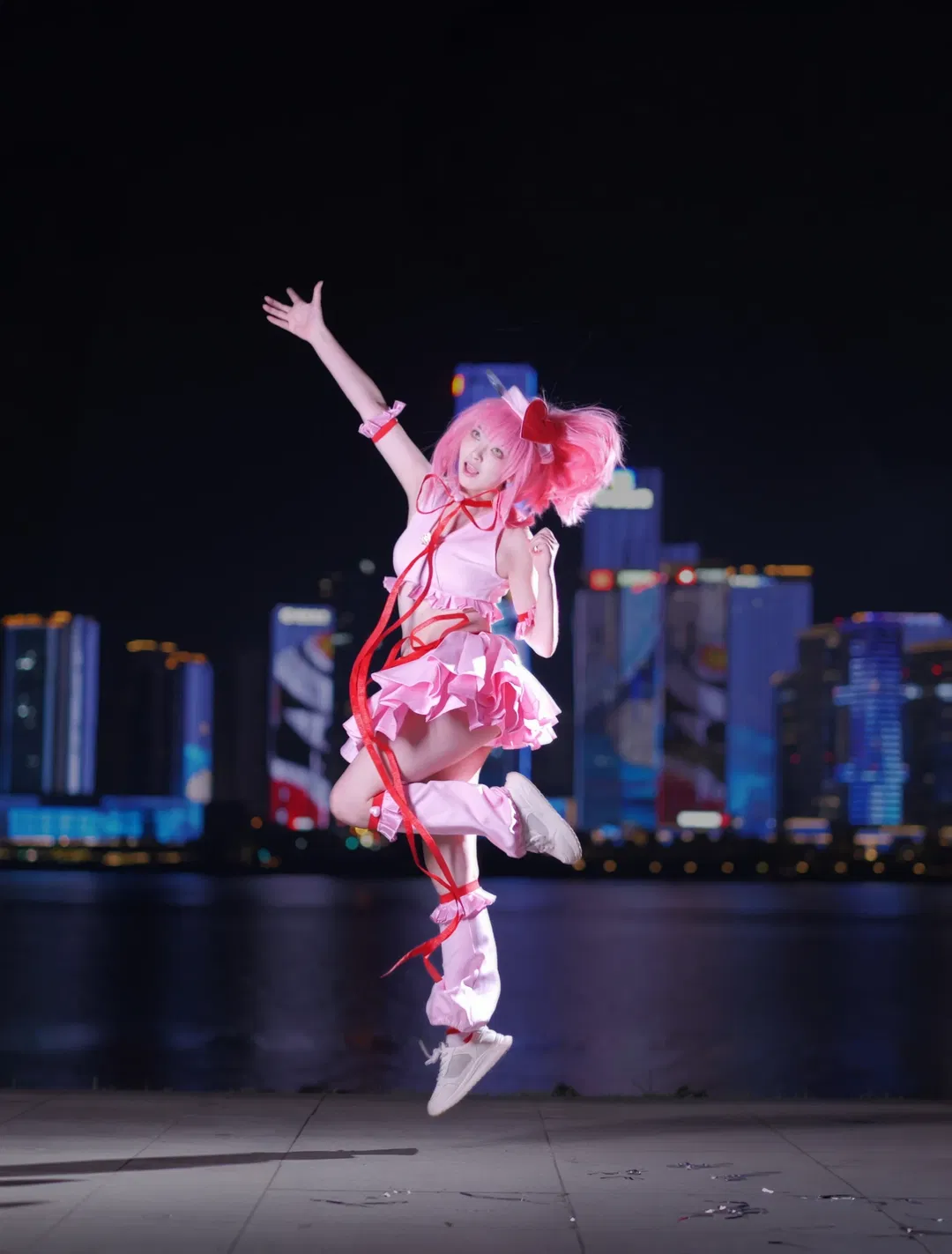
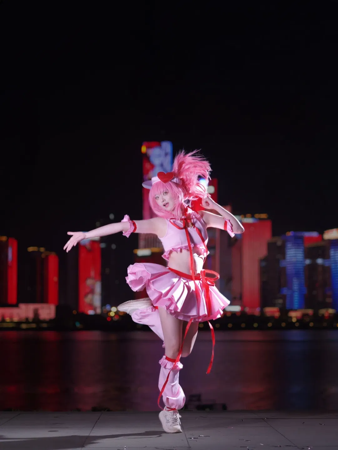
These shots were taken a few nights ago by the riverside. Aiming for an energetic, dynamic feel, I kept trying different jumps and expansive poses—action snapshots really test your facial control! Looking at these raw photos now, the pink costume and the neon lights in the background actually match quite well, but I hit a complete wall the moment I started post-processing. I tried tweaking several versions myself, but they seemed to look worse with every adjustment, feeling overwhelmingly stiff and unnatural—to the point where the unedited raws looked much better. So, I'm urgently reaching out for everyone's advice.
First, the biggest hurdle is balancing skin tones with the costume's hues. Because on-camera flashes or powerful fill lights were used on set, the highlights on the pink clothing clip very easily under strong light; pulling the curves just a bit causes the shadow areas of the ruffled frills to lose their fine details. Moreover, under the complex ambient lighting of the riverside, skin tones are readily contaminated by surrounding color casts. I attempted to strip out ambient tints using Color Balance, but the subject's skin ended up looking artificial and devoid of translucency.
Second is the saturation problem between the pink outfit and the red ribbons. In night scenes, red naturally has lower luminosity; if you don't brighten it, it looks muddy and dirty, but brightening or boosting saturation quickly leads to clipping and even jagged pixelation along the edges. I want distinct layering between pink and red, yet I'm unsure how to fine-tune these two neighboring hues precisely in the HSL panel.
Then there's the building in the background. The massive LED screen on it displays an overload of colors—clashing reds, blues, and yellows that steal the spotlight. I tried dimming the background to make the subject pop, but darkening the backdrop caused the subject's outlines to look grayish and threw off the overall contrast, making the person look pasted on. That signature translucent glow and moody ambiance typical of night portraits are completely missing.
The lighting ratio in this set is actually quite harsh, creating a sharp contrast between facial highlights and garment shadows. Right now, I'm at a complete loss on whether to lift shadows using tone curves or apply local masks to grade the skin and clothes independently. When looking at works by master retouchers, their night scenes boast clean, luminous colors where the subject seems naturally illuminated, and background color pollution is softened into rich ambiance. In contrast, my grading feels like forcibly smashing all colors together, resulting in a chaotic mess.
My current retouching direction aims for a clean, pure-toned Japanese style or something subtly cyberpunk, but executing it in practice turns into total chaos. I'd love to ask everyone: when grading night photos featuring pink outfits against complex neon backgrounds, how do you manage the overall tonal range? Any recommended shifts for color temperature and tint? Also, how do you split-tone highlights and shadows to give the image a more refined, lively feel rather than this current stiffness? I genuinely need some professional guidance to rescue this set.