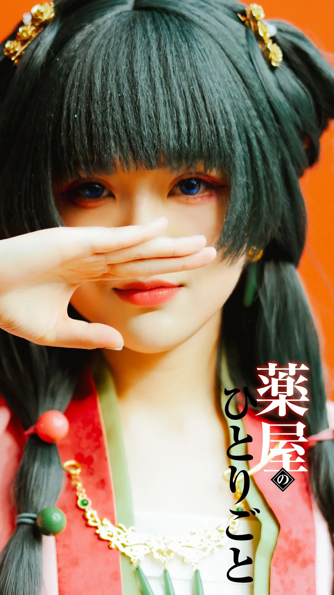
I worked through the hair and makeup for this set bit by bit myself, especially putting plenty of thought into eye makeup to capture that signature aura. I compared the red eyeshadow blending area against the original design several times, and to pair with this broad warm-toned eyeshadow, shifted my eyeliner angle to a slight upward lift—paired with bright blue contact lenses, that clarity and hint of sharpness in my gaze finally clicked into place. For base makeup, I went with a matte finish and added subtle highlights on the tip of my nose and chin to boost facial dimension. Even trimming the blunt bangs and side locks paid special attention to layers; to match the hair texture, the wig was carefully styled with a flat iron too, especially curving the ends along my jawline so my face looked slimmer and closer to the character.
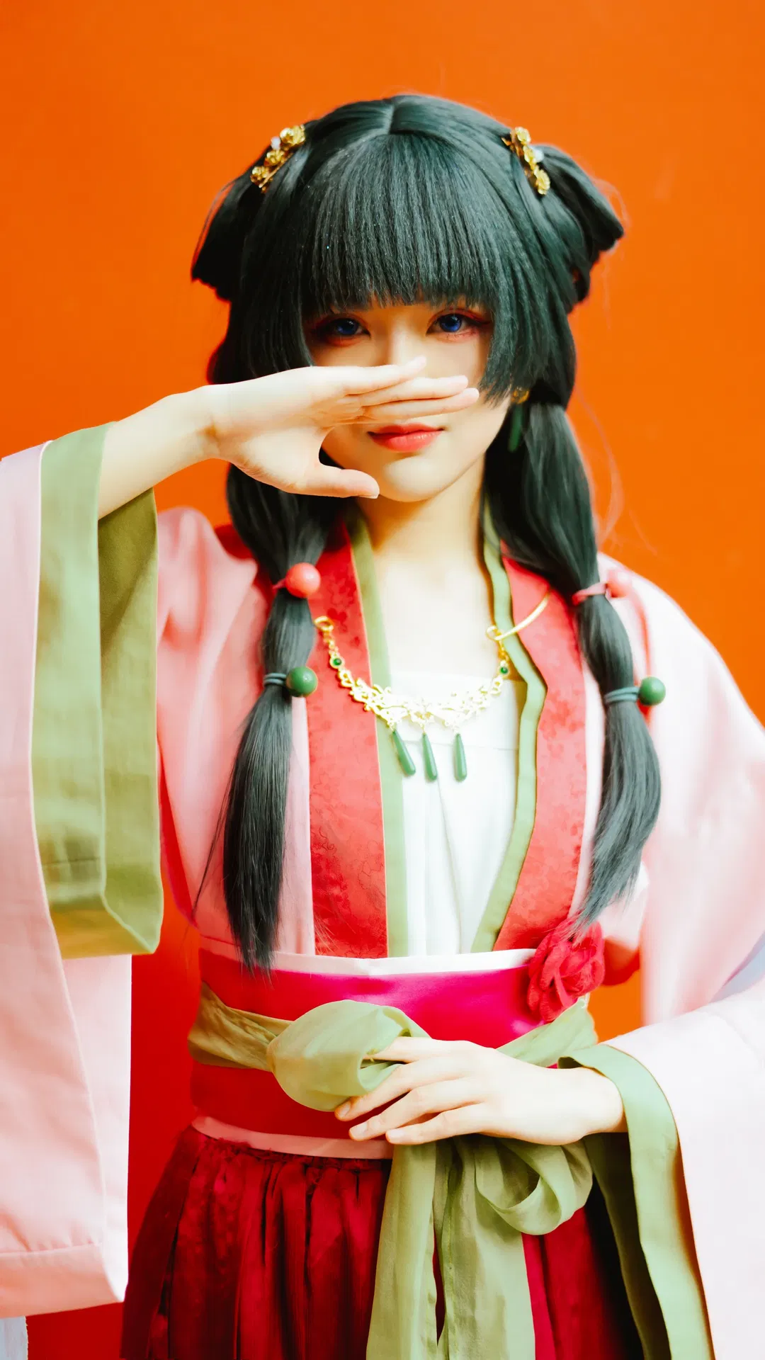
For the outfit, the red-and-green cross-collar garment has tons of details, and joining textured red fabric with green trim demands high smoothness. Wide pink cuffs layered over the green inner top needed seams smoothed down neatly. At the waist, I tried to keep the bright pink obi-style sash and green cloth-tie knot as flat as possible, adjusting the back tying method repeatedly so it wouldn't look bulky on camera. A gold cutout necklace with a green teardrop pendant, plus gold flower hair ornaments in my hair and red-and-green beads on the twin tails, acted as finishing touches for the whole look—requiring patient symmetry adjustments every time I put them on.
During the shoot, I thought about poses that fit the character's personality. Covering my mouth and nose with one hand while looking straight into the lens highlights the blue eyes nicely while adding a touch of mystery. To make the hand gesture look natural and graceful, I practiced angles in front of a mirror for a long time, testing and refining bone structure across the back of the hand and finger curvature through trial and error. Choosing a solid orange-red backdrop made the character's colors pop vividly, which put lighting to a real test—needing even front fill to keep facial colors clean while dialing back side light slightly to deepen facial features.
I truly want to give special thanks to our photographer and colorist for handling light, shadow, and colors so comfortably—大不列颠大魔女's color grading matched this mood to perfection. In post-processing, that Japanese lettering on the right side of the first image was actually hand-imitated and laid out by me bit by bit using brush strokes; to nail the feel of that lettering, I revised it over and over until my eyes nearly blurred, yet the final result really captured the original series' atmosphere. Imitating the lettering was also a way of deeply understanding the work's style—the roundedness and staggered rhythm of Japanese type can't feel too rigid, so I adjusted layout spacing again and again.
Even though the whole prep process was tedious, seeing the finished photos made every bit of effort feel worthwhile. From hair and makeup to costume adjustments and every tiny accessory, the state presented in front of the lens was pieced together bit by bit on my own. To me, cosplay is about refining these details down to the smallest touch and expressing them through body movement and expression. I'm really happy with how this set turned out overall—the clash of light, shadow, and colors gives the whole frame strong tension and sparks even more ideas for my next project.